Friday, December 12, 2014

SporTimer clock

It turns out that the clock used in the Montreal Forum and Maple Leaf Gardens and elsewhere was made here locally (Thunder Bay).  It was made by the Port Arthur Shipbuilding Company (aka PortShip aka PASCOL).


Port Arthur News Chronicle has article of clock being used locally - March 7, 1930 pg.1


A Winnipeg Tribune article from Oct 28, 1931 tells of the SporTimer clock being shipped to the Montreal Forum.


 Found a picture of that shows a portion of the clock at the Montreal Forum (above).  Took a couple screen shots of the clock from YouTube videos of Stanley Cup playoffs.


Here's a blueprint for a proposed four faced clock for the Montreal Forum that obviously wasn't used


The one that was in Maple Leaf Gardens wasn't there the first season the Gardens opened (1931-32) but was there for the second season.  Lasted there up until 1967.  Sometimes referred to as the "Player's Please" clock because of the advertisement on it.


A Blueprint showing what looks like went into Maple Leaf Gardens: 19 feet x 9 feet is the dimensions shown here.


Another blueprint for Maple Leaf Gardens showing a slightly different idea for the arrangement of the speakers than what was done.


SporTimer was also at the Winnipeg Arena for a while.  Here's a picture of it from the arena opening in 1955.


Close up of the clock.


The proposed installation for Winnipeg Arena.


SporTimer was also in the Stanley Stadium in Copper Cliff.  Article from February, 1937.


 Here's a picture of the inside of Stanley Stadium a couple years earlier for it's official opening in 1935.


And a postcard photo of the outside of the building.


 Was home to the Frood Mine Tigers - Winners of the Allan Cup in 1937


Stanley Stadium was demolished in 1976 and replaced by the McClelland Community Centre at the same site; official opening in 1978.


Found this advertisement from the Syracuse Post Standard from March 27/53 online.


The Port Arthur Shipbuilding Company no longer exists.  The company that took over the area as a repair yard was Lakehead Marine and Industrial.  They went bankrupt this year and closed; they sold off all their equipment in auction.

Here's an old pic of the Port Arthur Shipbuilding yards:


Here's a couple links regarding the Lakehead Marine and Industrial bankruptcy and auction:

http://imdauctions.com/auctions/lakehead-marine-industrial-inc-complete-shipyard-featuring-large-capacity-turning-boring/

http://www.cluemachines.com/pdf/november-auction-2014.pdf

http://www.cbc.ca/news/canada/thunder-bay/lakehead-marine-and-industrial-auction-saddens-many-1.2832884


Beside the Maple Leaf Gardens and the Montreal Forum the SporTimer clock was in many arenas including at least a couple locally:


The Prince of Wales Arena building which was constructed in 1919.


(some trivia: a previous arena was also at this location: Fort William's Arena Rink constructed in 1905 and burned down in 1912; site then used as an outdoor skating rink 1913-18).


The Prince of Wales Arena was turned over to the Canadian Government and used for the Fort William Armouries.  The Armoury had its official opening in April 1943 - here's the area as shown in this section of 1950 fire insurance map with the Armoury at 223 N. Archibald Street. 


Here's a couple photos of the Fort William Armouries from May 1956:


From this photo you can see the Fort William Gardens (which opened in 1951) in the background:


Interior of Fort William Armoury from a April 1943 newspaper clipping.


Still have to verify it but a poster on a Canadian Army forum site has the Fort William Armoury burning down in 1965.  Henderson Directories for that location have the Fort William Armouries there in 1959, the Post Office building there in 1966 and no listings of anything at that spot for the years in between.

*** EDIT Feb 21/15 ***
Newpaper article in Chronicle Journal "Shares sold to build arena" by the Thunder Bay Museum Feb 15/15:
"armoury ... in May of 1955, it caught fire.  Though condemned by Chief Lockwood, the building seems to have been repaired but, by 1960, it was gone for good."


Post office building was built there after the Fort William Armouries building.  Hasn't been a post office for a while but is being used some federal government departments - Canadian Grain Commission, RCMP, etc.  Picture is from the same side as the photo above.


I heard the Fort William Gardens didn't have one of the SporTimer clocks but I did find a picture of the Fort William Gardens from the 1960 Brier that does show an analog clock with 'Players Please' advertised on it, so I quite possible they had a SporTimer for at least a little while in the building.


Looks like it may be the same clock in Fort William Gardens for the 1974 Ontario Winter Games.


Another picture of the Gardens that must be from around the same time period judging by the 7up ad on the clock.


And from The Squires at the Gardens in 1964 or 1965


*** EDIT [Feb 9/15] ***
Thunder Bay's Parks and Recreation Centennial Resource Package (1898-1988) makes reference to the clock that was put in Fort William Gardens in a reference to a March 15/51 newspaper article from The Times Journal:
"Hanging over the centre ice area was a big hockey sport timer, donated by the Imperial Tobacco Sales Company of Canada Limited.  The clock informed the fans of the period being played, the time remaining in each period and the score of the game.  Additional features included eighteen loudspeakers., ninety 1000-watt bulbs and six large blowers which would heat the building during the winter and keep it cool during the summer."


The other local arena that the Northwestern Ontario Sports Hall of Fame says the SporTimer clock was in was the old Port Arthur Arena Rink on Court Street (see the 2012 article near the bottom of this post) - built in 1923 and which burned down in a fire in 1931.


 This is the arena that replaced the burned down one in 1932  and was later condemned and torn down in 1959.


*** EDIT [Dec 31/14] ***
From the Port Arthur newspaper of the time (The News Chronicle) - June 7/60.  From this article looks like either there was a different clock in the 1932-1959 Arena, or there never was a clock in the the first Arena Rink that burned down in 1931, or possibly something else entirely ???  In any case looks like they were looking for a new home for the clock; not sure if it found one.


 Location of where the Arena Rink was is currently home to a Safeway grocery store.
https://www.google.ca/maps/place/Safeway/@48.437807,-89.219876,17z/data=!3m1!4b1!4m2!3m1!1s0x0:0x7f032d2b07cb8552

Since I've digressed quite a bit already.  Here's an earlier rink that was in Port Arthur and predates the Sportimer by many years: the Lake City Rink. 
Haven't researched it much but here's the first photo I've seen so far.  In a newspaper article from November 1958.


From the description I believe its location was likely here (1908 Fire Insurance Map)


The Northwestern Ontario Sports Hall of Fame put an article on the SporTimer in the local paper a couple years ago.  They mention a donated SporTimer clock but it isn't currently on display there and is in storage.  If I can in the future get pictures of it I hope to uploaded them here.

 
On Google ran across the patent drawings for the SporTimer.  Here's the first drawing of eight.


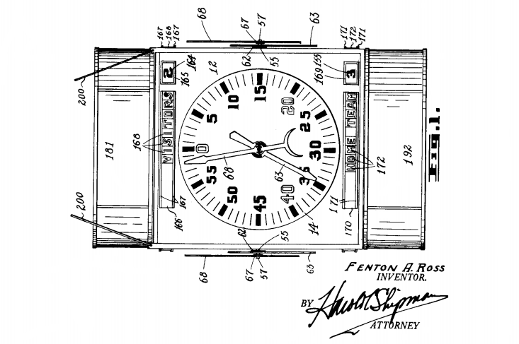
All of the 8 patent drawings and information can be found here:
http://www.google.com/patents/US2071274


*** EDIT July 11/15 ***

Found some information on the W. F. Martin that is mentioned in the "Where Legends Live On" article a bit above.

W.F. Martin inventing automatic hockey clock - from Port Arthur newspaper News-Chronicle.  April 9, 1927.

 and a short article in the Winnipeg Tribune - April 11, 1927:


The clock used for the first time in Fort William's Prince of Wales arena.  News-Chronicle March 3,1928:


The clock in the Winnipeg Amphitheatre for the 1929 Allan Cup - from Winnipeg Tribune March 27, 1929:


Here's a picture of the outside of the Winnipeg Amphitheatre aka Shea's Amphitheatre:

His unfortunate death a few months later - Winnipeg Tribune May 27, 1929:


and the obituary in his home town paper. News-Chronicle May 25, 1929:


His gravesite is in Section 15 of Riverside Cemetery in Thunder Bay.  
Unmarked - approximately where the red star is:


He he is pictured, but not in the caption below, in a photo of the Kenora Thistles team.  He is in the middle row at the far left.
*** [Edit: another source has Matt Brown as the person in the middle row at the far left.  May not be Billy Martin - not sure if Martin played any games for this Senior team.  Found a mention of him as a spare for one game so far.]
*** [Edit again: lower photo from Lake of the Woods Museum (1977.40.8) - Martin's name written below his face]


He is also in a picture for the 1902-03 Rat Portage Thistles.  They challenged Ottawa for the Stanley Cup.  They lost both games of the two games series 6-2, and 4-2
Picture is from the Lake of the Woods Museum (1977.40.10)


Also in the team picture for the 1903-04 Thistles team:
lower photo is from the Lake of the Woods Museum (1967.55.1)


Wednesday, September 3, 2014

Slo-pitch : baseball cards

Made up one, then two, and eventually sets of six baseball cards for some members of the Slo-Pitch team I was on this year.

The first two (myself and Val) were originally of different sizes but remade the images so they were 3 1/2" x 2 1/2".  The picture I used for myself was from a previous team I played for in the league because I didn't have any pictures of myself from this year.

The effects used for the pictures were just using a regular digital photo and applying the the Hot Wax Coating (in Artistic Effects of Corel PaintShop Pro X4) and then I think One Step Photo Fix.  Added in a frame and text (3 fonts used) for the front and the back, and an old paper background for the back.

Didn't get the back and front images aligned up perfectly when I printed two at home and eventually the set of six at an office supply store; the office supply store ones turned out a little darker and I think a slightly heavier cardstock was used by them.

All sets I left the white line along the bottom of the back of the card.


Some sets I went over the white line at the top of the front of the card with a black sharpie.


Here's the images (and not pictures of the printed out cards like above).


Just made up some stuff for the backs of most.  Val has received more than a few bruises getting in front of the ball in the infield, pitching and other aspects of my game vary day-to-day, the ideas for Chris were from the San Diego cap he is wearing in the photo, for Mitch it was the shorts, for Nick it was the cowboy boots, Dan was completely made up.

If I end up making cards similar to this again, I will likely have a larger plain border around each so that if the front and back don't exactly align it won't look quite as off.

Sunday, July 20, 2014

Slo-pitch: Part II

Made another DIY to wear while playing on my Slo-pitch team - this one a baseball vest. Letters stripped off of 2 name bars I had from previous Ebay purchases


to be reordered and sewn on again (luckily most letters included in the name I wanted - some modifications to make the L and the 2 F's). In the picture the front logo still to be modified to match previous project 'U ff' front crest. Rustclops burgundy main body cut out - gold still needs to be cut out.  Letters need to be sewn on name bars, and everything still needs to be sewn on jersey.

The finished product: front and back.
Eyeballed the alignment of name bars on back before pinning and sewing it on - probably should have spent more time and measured it instead. I'm likely the only one that will be seeing it in person that will look close enough to notice. Should also have had stuff on back of vest higher and closer together since it's an XL and if I end up wearing it with baseball pants I think the F.F. will disappear when tucked in.


Here's a closeup of the Rustclops on back.


Almost forgot to mention this: Rustclops is from another Shadow league entry for the Clink Room.


As far as playing Slo-pitch, I played a game this past week on my brother-in-law's team.  They were going to be short guys so I was an "emergency call-up" for The Benchwarmers.  He plays in a 7 & 3 League (field is 7 guys and 3 girls).  Played mostly the same as my 5&5 but I noticed some differences in rules.  As far as strikes you get an extra strike if the second strike is a foul ball.  If you walk a guy when a girl follows in the batting order, the guy gets 2 bases.  Girls are allowed to intentionally bunt [no one is allowed to bunt in my league - though occasionally there are the unintentional "full swing bunts", and they are allowed.  I've done those when I topped a ball.  You just put your head down and start running hoping that the back catcher or pitcher don't get to the ball quickly or that they throw it away].  Also, it isn't a strike when the ball hits home plate only when it hits the "mat" behind the plate.  The "mat" looked to be a little wider and I think shorter than in my 5&5 League, and it's made out of wood so it's easier to hear a strike.  Fielders don't need to stand behind any line in the field and can be anywhere they want.

Monday, July 14, 2014

Slo-pitch & baseball jersey for Slo-Pitch

After many, many years of working nights I am back working days.  Joined a Slo-pitch team back in my old league : Thunder Bay 5 & 5 Fun Slo-Pitch League.  Small independent (one of the few that wasn't absorbed by the Molson or Coors Light leagues years ago) non-competitive league.

If you are wondering what is 5 & 5 ? and what is Slo-Pitch  ? :
5&5 means you field 5 guys and 5 girls - 10th player is an outfield rover.  Batting order alternates guy-girl-guy-girl, etc.  All outfielders stand behind a line in the outfield until the ball is hit


and infielders must stay on the infield dirt until the ball is hit.  Slo-pitch is of the lob style of pitching - under handed and the arc of the ball must go over the batters head (or is it 6 ft.? I need a recent copy of the rules) and is unlimited (can go as high as you want).  Ball is a regular softball (think league is using grey dot this year).


All games are 3 balls and 2 strikes; all foul balls are strikes and if the ball hits the plate or the mat behind it it's a strike.


There is also an orange safety base on first.  Runner goes over orange - first baseman uses white; to avoid collisions at first.  There is also no lead offs, stealing, or sliding.


Regular season games are 7 innings (so league can get 2 games/day in all season before it is dark - league only has the one diamond).  Tournament games are 9 innings.

I had previously played in the league from 1992-2007.  Towards the end I was the team rep. and league V.P. for a couple years.  After I was working straight nights I had to quit playing and my brother in law ran the team for 1 more season before it folded (he then joined a more competitive league).  Team I was on had many sponsors over the years Country Home Cabinets, Twin City Stingers II (original was before my time on the team), Pier 61, L.A. Blues, Da Vinci , Friend's [Bar & Billiards], Glory Days, and Buzzy's.[Jerzee City].  One year we did the improbable and won it all:


Enough on Slo-pitch - on to the jerseys.  I joined the team late and they only ordered so many jersey to start with so I decided to make my own.

I had acquired a grey maroon striped grey baseball jersey a while back with this logo on it (turned sideways).


Blue lines are just showing what I am did to convert it into a U f f crest instead (main sponsor for the team I'm on this year is Unleashed Fighting Fitness).  Part of the reason I did this is to save what burgundy twill I have for the team name on back and the main logo.  Here's how it looks on the front:  If the jersey looks familiar, it's because it's the same jersey I got off Ebay for one of my earlier Ryberto's jerseys (but with a different number on it).


Now for the back.  For the back I used a font called Bazar (downloaded from Tack-O-Rama site). Dachshund is taken from a Clink Room member's Shadow League contest entry from a while ago.  My first though was of doing a dog or dog's head with a leash lying on the ground beside it, but then I remembered this contest entry and his dachshund is much better than anything I am likely to come up with


Was originally going to put the vest on the dog but looked to be a bit much with the big #1 already on the back of the jersey.


Here's a close up of the dog:


Saturday, March 22, 2014

Game of Thrones Faux-Knit concept

Sparky Chewbarky is a member on the Chris Creamer Forum.  I think I first became aware of his work with his Halifax Highlanders concept.  He went all out with his concept; not only logos and several jerseys but goalie masks, mascots, loads of different merchandise, an arena, and a video.
http://boards.sportslogos.net/topic/84509-halifax-highlanders/?hl=%20halifax%20%20highlanders

More recently he came up with some Faux-Knit Olympic Sweaters for Canada, USA, Finland and Sweden:
http://boards.sportslogos.net/topic/96515-faux-knit-national-olympic-hockey-sweaterswant-one-also-new-template/#entry2144574

I slightly modified his Faux-Knit template (designed more for Photoshop and the like) so it could be used by the more low-tech MS Paint or Paint.net users.  Just use the 'Paint Bucket' aka 'Fill with Colour' to colour in the blank spaces one by one.

Here's one for the back:

Made a Game of Thrones/Song of Ice and Fire concept with the template.  The Stark hockey sweater concept is in a style similar to Dave's Olympic Faux-Knits. If it's not readily apparent, it's supposed to be a direwolf on the front with snowflakes on the shoulders:


If you want to see some other Game of Thrones jerseys concepts a great place is Dave's Geeky Hockey:
http://davesgeekyhockey.com/?s=game+of+thrones

Some of concepts have been produced as actual jerseys by the Geeky Jerseys site https://www.geekyjerseys.com/index.php and are usually only available for a limited time and are gone after that (unless enough people show enough interest for a later re-issue).

Monday, March 17, 2014

Jofa goalie helmets

While I have previously posted the pic of my Soviet goal jersey and my San Diego Samurai goal jerseys a while ago, I didn't post the helmets I wear with them when wearing them in goal.

Both of them are decorated with vinyl decals.  Most of the decals were obtained through the website stickeryou  by using my icoke.ca points - unfortunately the free icoke deal is ending the end of next month.

With all the roundness in the Jofa helmet getting the larger decals to lay flat can be a bit of a challenge.  With certain types of vinyl some people use soap and water mixture on helmet or mask to help it lay flat.  I think some heated it up to help stretch the vinyl when laying it down.  There is some info on these methods in the goaliestore.com thread on vinyl mask graphics:
http://goaliestore.com/board/forum/equipment/equipment-forum/96191-vinyl-mask-graphics
may be something in the thread on 'Helmet decals' also.
Myself, if I remember correctly, I don't think I used soap and water or heat but just tried to stretch the large ones out a bit when putting them on.  Takes a bit of patience - more than I have much of the time.  The results were far from perfect but not too bad.

Here's the Soviet one.  A Jofa 390 helmet with the Jofa 267 cage and a lacrosse dangler:


Here's the Japan one.  A Jofa 390 Helmet with a Cooper GL100L cage/dangler.


The clips on the side of the Japan one are homemade; just doubled up and cut some of the metal strapping of the kind that is used to hold up duct work.  The clips on the side of the Soviet one are some picture hanging clips.  Have since found and bought some of the clips made for this helmet (have one set installed on one of Jofa helmets I use to play "out" - defence and forward).

You may have noticed a couple stickers that don't match the Japan/Samurai theme - the IVO and Czech shield stickers were a memorial for one of the players, who passed away a few years back, in the afternoon group I currently play in.

Sunday, March 16, 2014

Dock Placement Chart

A while back made a "fun" placement chart for work.

Work at a courier company; the name of it is close to the one in the image below.  If there was a coffee machine still on the counter in the lunch room at work this would make a good logo for it.


A placement chart just shows where each dock employee is working that shift.  I'm sure you're not interested in the minutiae of the internal set up of the night dock at work so I'll spare you those details.  The usual placement chart while serving it's purpose is rather dull, so I made a video game themed one.  I think the last time it was used was on a dock employee's last day at work before he transferred to another city.

Most of the characters I got from font packages by 'Goatmeal' called 'The First Six Year' (it also comes in six parts).  It's a collection of six arcade video game dingbats [1978-1983]:
 http://fontstruct.com/fontstructions/show/the_1st_six_yrs_1of6
I just found pics of the girders and ladders online - they aren't the best quality images at that size but they do the job.  Modified a Donkey Kong logo to make it Dock Monkey.  It can be taken as a term of derision for the dock employees, the lowest guys on the totem pole at the company, but it has been adopted many of the dock guys to describe their jobs.


To tack on a bit of humour, Here's a link to David Thorne's site with the entry regarding the subject of couriers:
 http://www.27bslash6.com/courier.html